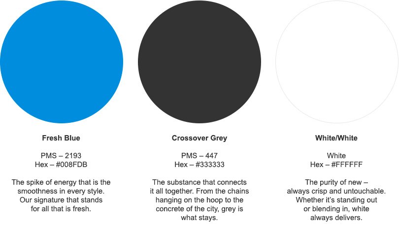
Color Palette
Guidelines
The Primary Brand Colors, Fresh Blue, Crossover Grey, and White/White, should not be modified or adjusted in any way. Primary Brand Colors can be used together in the proportions indicated below. Fresh Blue should never be the dominant color in any design.
Primary Brand Colors can be paired with Supporting Neutral Colors. Supporting Neutral Colors should be used in the proportions indicated below to play a supporting roll in design. Supporting Neutral Colors that complement each other can be used in any combination as long as the integrity of the brand is not diminished.
Primary Brand Colors
PMS — 2193
Hex — #008FDB
The spike of energy that is the smoothness in every style. Our signature that stands for all that is fresh.
PMS — 447
Hex — #333333
The Substance that connects it all together. From the chains hanging on the hoop to the concrete of the city, grey is what stays.
White
Hex — #FFFFFF
The purity of new — always crisp and untouchable. Whether it’s standing out or blending in, white always delivers.
Supporting Neutral Colors
#FAFAFA #F2F2F2 #C8C8C8 #ACACAC #666666 #000000


